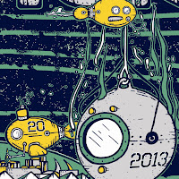
It's that time again! These process posts have been getting positive feedback when I see folks in the lot, so I figured I would keep it going with the two posters I have planned for the fall. Journey to Hampton has been in my head for a little over a year now. Sometimes an idea has to wait until they play a venue again. Keep checking this post for photo updates of the printing process.
Remember when ink hits paper, the pre-order ends.
I started with the venue itself, and decided to make one for each night.
The little robot fish (what I them) came later. Theme From the Bottom was the song I held in my head for the inspiration.
The bathysphere was something I thought of during the drawing process. I wanted to combine elements of the past and the future. You can see on this early drawing where I changed my mind about where the word Hampton would appear.
Here's where the layers started to come together.
Adding the background (paper) color.
Ink selections have been made. A little mixing will happen. Check out that silver!
Seafoam Green being created
The paper is here!
 |
| Colors against the paper stock |
 |
| Soon to be full of blue paper. |
 |
| Transparencies are done! |
 |
| Seafoam green on blue |
 |
| SILVER! |
 |
| Seafoam and Silver |
 |
| White has been printed. It's hard to tell in this photo, as the white is similar to the silver with a flash. |
The finished poster!


bad ass
ReplyDeleteI like these "work-in-progress" photos! Great job!
ReplyDeleteI diggs the jiggs!
ReplyDelete