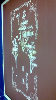
Here's a peek into the process that led to the Oklahoma City design. All
these are usually created in the same way. Starting with basic
sketches, then moving on to adding ink, then scanning everything in.
Sometimes the idea doesn't get fully fleshed out until I have everything
on the canvas, as was the case with this one, and also the Dick's art.
 |
| Finished Art |
This is the very first two sketches that started the ball rolling for the Oklahoma City poster. I thought about all the different animals that could work with a traffic light on their head...and of course the giraffe won out.
Once I had the main element ready, I began laying everything out. This one took me a lot longer than any others. Not sure why, but I played with the spacing on this one for what seemed like forever.
This is when the idea for the corners and the border struck me. Zoo. Slave. I love it when an idea guides you. It was downhill from this point.
Once everything came together like I wanted it, I sat and tweaked it until I liked it. Then it sat like that for about a week or so until I added the moon.
Once the art was completed, I converted it and sent it off to The Print Monkey.
At this point the color separations have been done.


radical@!
ReplyDelete